Pharmaceutical (NDA)
Accessibility in Data Visualization.
Reworking color systems used across enterprise BI reports to make them accessible to users with color vision deficiencies.
- Client
- Global pharmaceutical company
- Role
- Product Designer
- Year
- 2021
- Scope
- Accessibility · Color systems
About the project.
One of the largest pharmaceutical companies asked me to evaluate the usability of digital reports generated by various software tools. The primary goal of each report was to deliver meaningful business insights. These reports were then used by planners and managers working across different levels and areas of expertise, helping them make well-informed business decisions based, among other things, on the data presented.
At that time, digital reporting was going through a period of transformation. One of the business objectives was to identify potential areas for improvement and propose better solutions — while also staying mindful of the tools' limitations.
Challenge and problem definition.
The main challenge I faced was directly tied to the variety of business intelligence tools used to generate the reports (e.g., SAP Analytics Cloud, Business Objects, TIBCO Spotfire, Tableau, ThoughtSpot, and Google Suite). These tools offered very limited options for customizing the interface or user experience — or when customization was possible, it was often too costly from a business standpoint.
I couldn't change or unify the design patterns of each individual tool, but I noticed a common thread across all reports: they used the same color palettes for data visualization. I realized that the color choices could potentially cause accessibility issues, and I decided it was worth investigating that further.
Process.
- 01Evaluation of the color palette used for data visualization in terms of accessibility
- 02New palette proposal, carefully checked against any potential accessibility pitfalls
- 03Mapping old colours to the new ones
- 04Presenting design proposals to the business
- 05Providing example use cases and formulating some additional recommendations for data visualization
What helped me on the way
Books: Fundamentals of Data Visualization — Claus O. Wilke.
Online resources: davidmathlogic.com (online colorblindness simulation tool); Stark — Adobe XD plugin (contrast and colorblind checker); NoCoffee — Chrome Plugin (quick check against different vision problems).
1
Evaluation of the color palette used for data visualization in terms of accessibility.
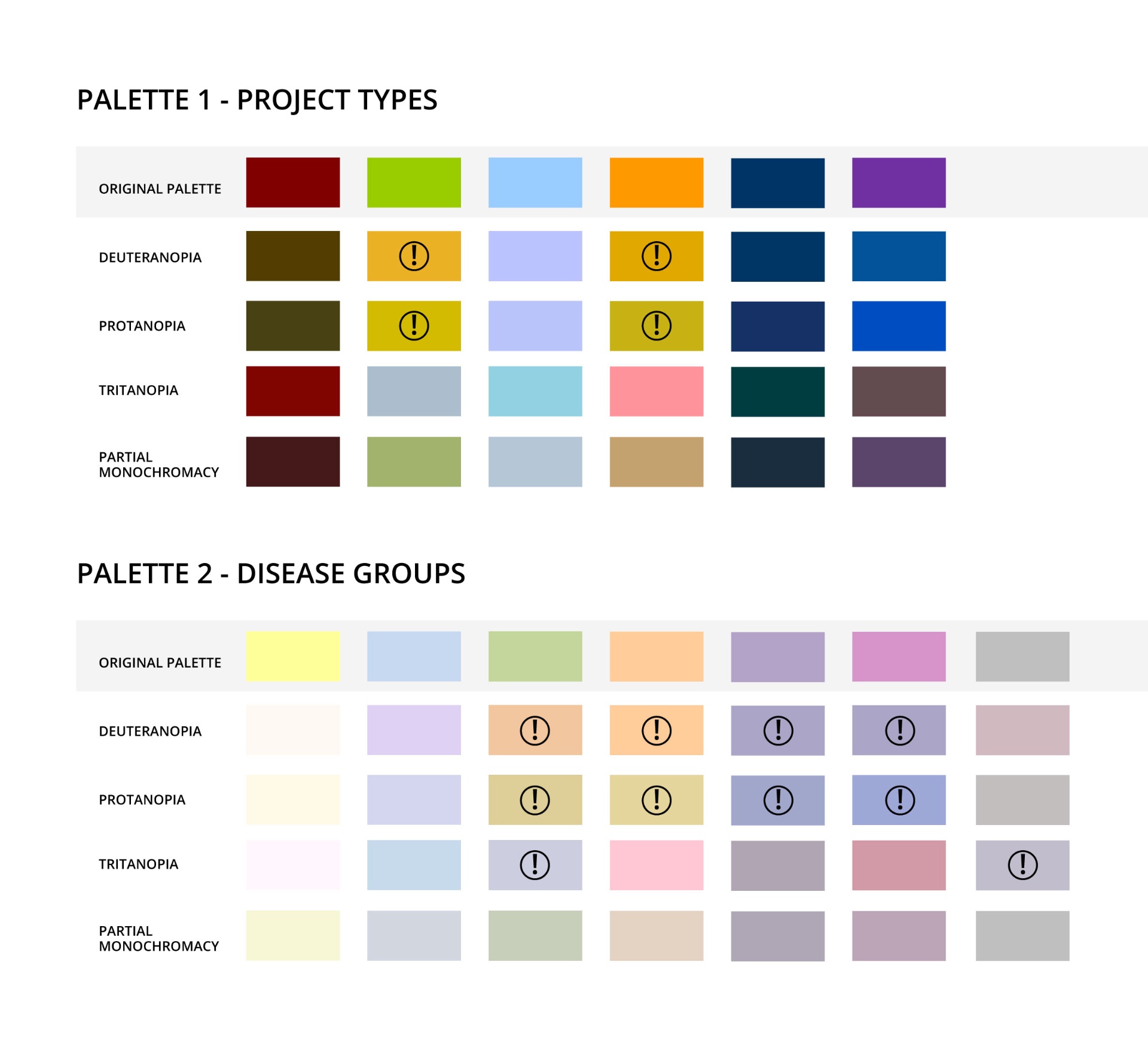
The color-coding used in the reports I analyzed was based on two distinct palettes. One represented various project types, while the other was used to indicate different disease groups.
I evaluated both palettes for accessibility, focusing on users with Deuteranopia, Protanopia, Tritanopia, and partial monochromacy. Initially, I also prepared variants for Deuteranomaly, Protanomaly, Tritanomaly, and full monochromacy. However, I ultimately decided that the first three would be less relevant, as my goal was to ensure accessibility for users with dichromacy rather than anomalous trichromacy.
As for monochromacy, it fell outside the scope of my analysis. With 6- and 7-color palettes, it would have been nearly impossible to select a set of colors distinguishable to users with full monochromatic vision. In this case, I planned to suggest alternative ways to convey the same information — using means other than color — if needed.
The evaluation confirmed my initial concerns. The results clearly showed that some of the colors were too similar to be reliably distinguished by users with dichromacy.
2
New palette proposal (carefully checked against any potential accessibility pitfalls).
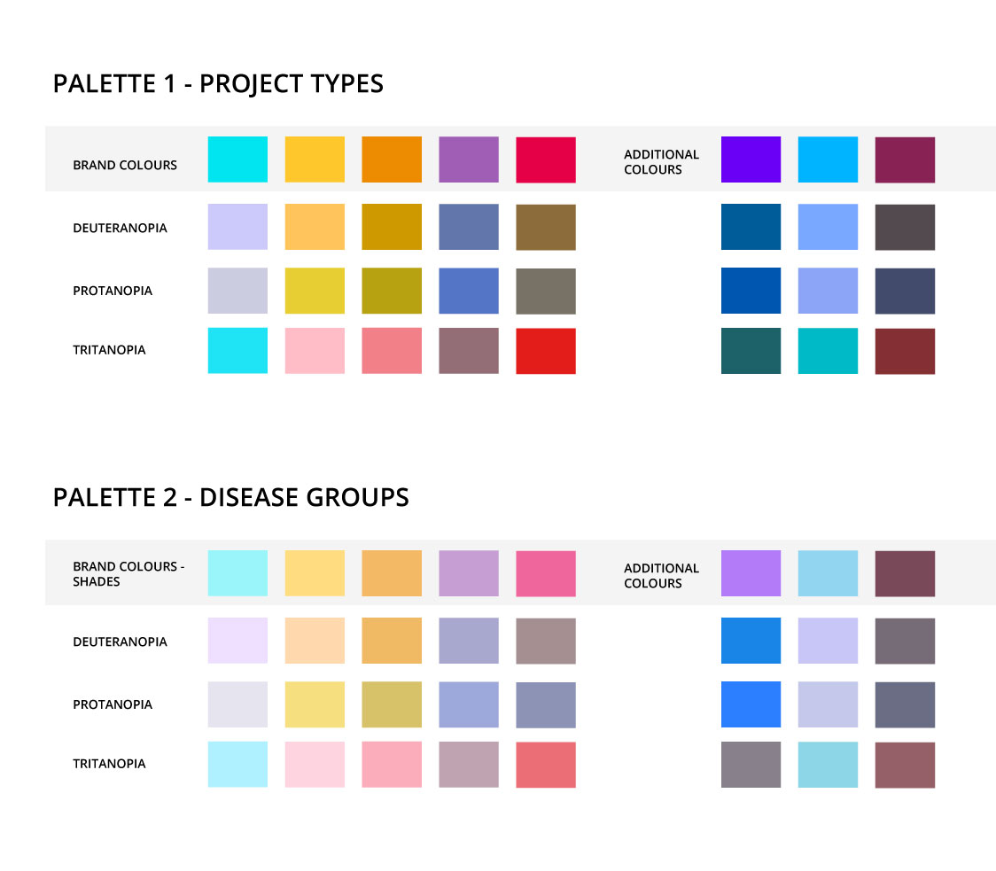
Once it became clear that the colors needed to be changed, I naturally had to propose an alternative. But, of course, in the corporate world, designers don't work in isolation. My first point of reference was the brand style guide, which defined a set of primary and secondary colors along with their shades. These also had to be evaluated for accessibility.
After carefully checking the available colors against Deuteranopia, Protanopia, Tritanopia, and partial monochromacy, I selected 5 out of 8 colors from the secondary palette as suitable.
The two original color palettes I was aiming to update were quite different in nature: the first one consisted of saturated shades, while the second was composed of lighter tones. To recreate these, I decided to add three additional colors to the initial brand-based set to build the first (saturated) palette. Then, I lightened and desaturated these to create the second palette — making sure both remained in line with the accessibility standards I had established for color blindness.
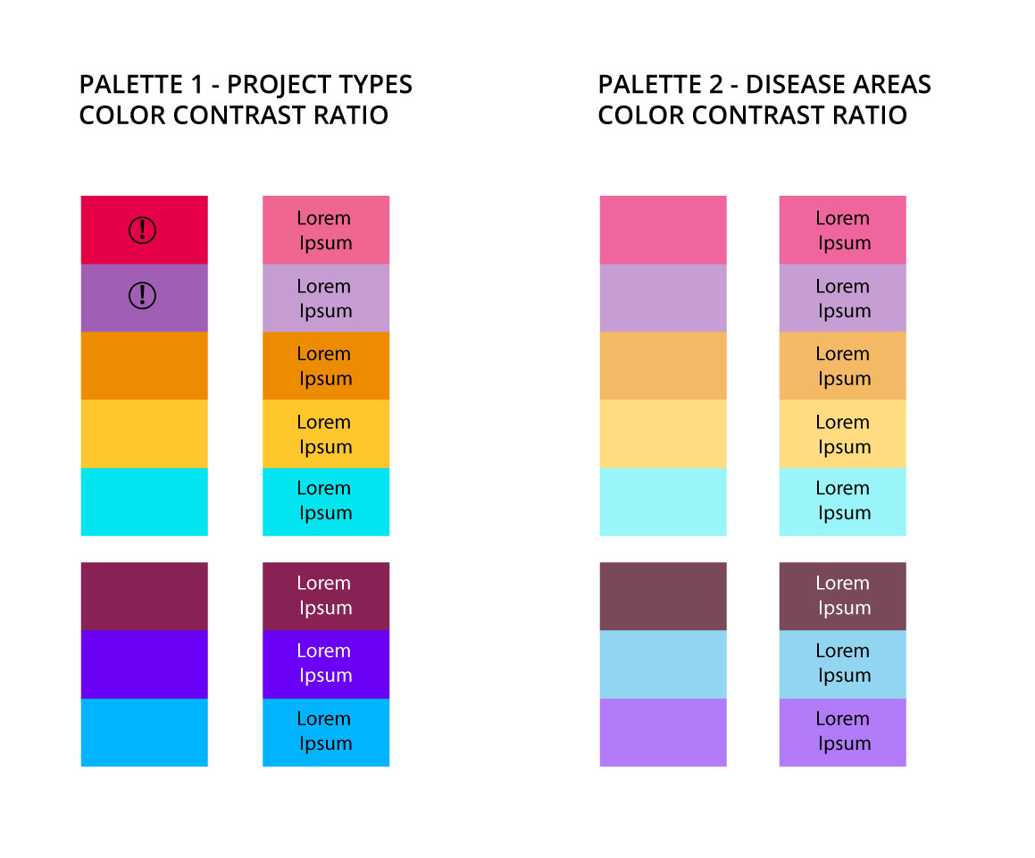
My final task in this phase was to verify the color contrast ratios, as I knew that in some cases, text would need to be displayed on colored backgrounds. After running this test, I decided to slightly lighten two of the colors from Palette 1 to ensure that using black text on those backgrounds would fully comply with accessibility standards.
3
Mapping old colours to the new ones.
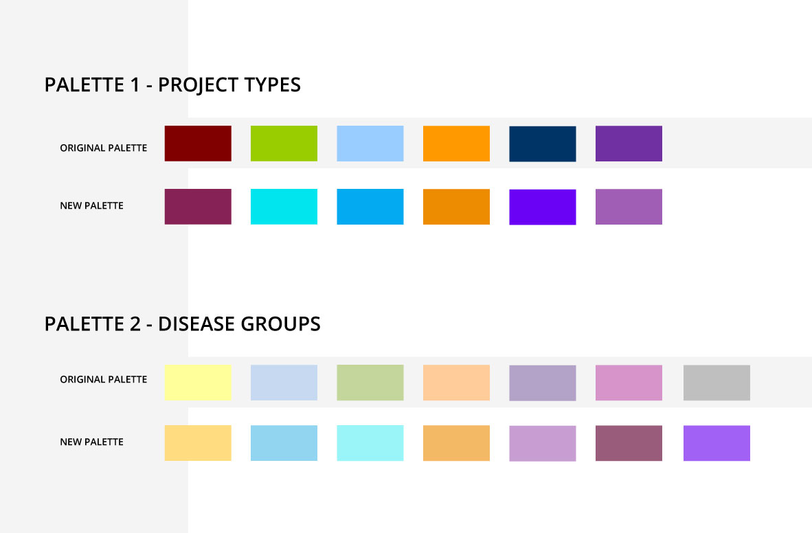
The third step in my process was mapping the old colors to the new ones.
I wanted to avoid making random choices, knowing that users were already familiar with the original palettes. My goal was to minimize adaptation time — and in some cases, potential frustration — by making the transition as smooth as possible.
To achieve that, I focused on matching each color with the closest possible alternative from the new set.
4
Presenting design proposals to the business.
The next step was to promote my work and gain business buy-in.
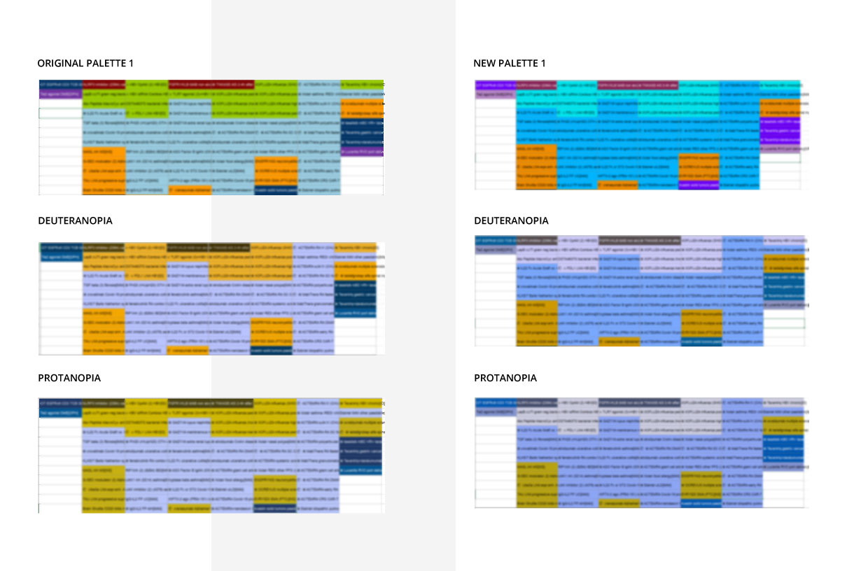
I prepared a short presentation that included visual comparisons of how the current and proposed palettes appear to visually impaired users. I also included some statistics estimating the number of people who might struggle with the original palettes — according to my findings, the issue affects around 2% of the male population and up to 1% of females.
To make the impact more tangible, I showcased the difference between the old and new palettes using real-world examples. I adapted existing Excel reports that were originally based on the outdated color scheme and presented side-by-side comparisons. (Naturally, any sensitive content in the report excerpts was blurred for data protection.)
My main goal was to demonstrate that improving accessibility wouldn't turn things upside down. With proper color mapping, the transition felt natural and easy for users — helping drive adoption without resistance.
5
Providing example use cases and formulating some additional recommendations for data visualization.
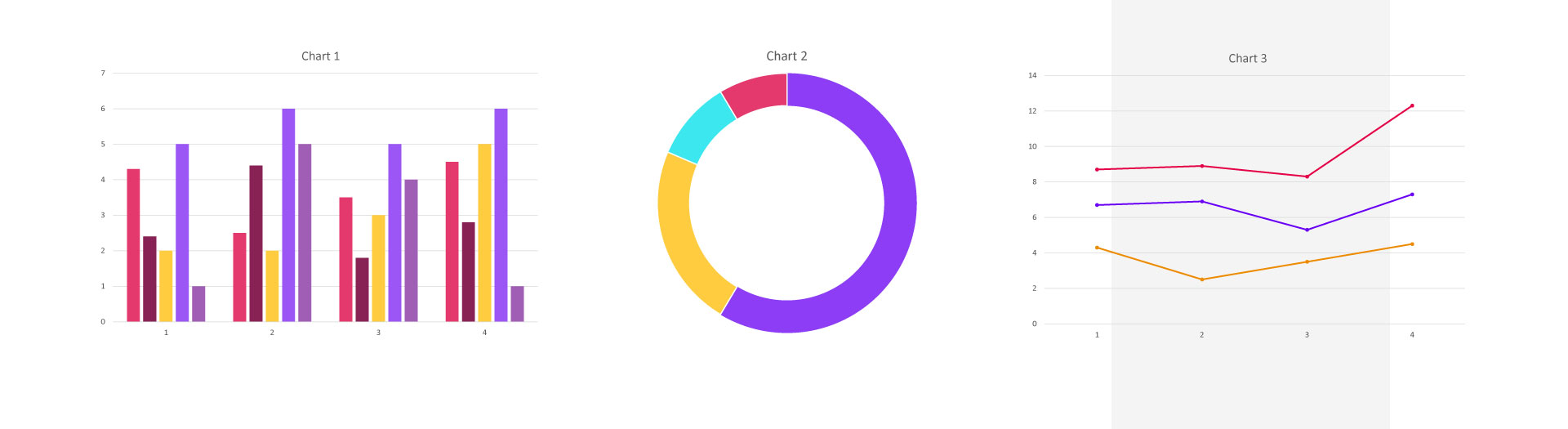
In addition to the Excel reports, I decided to provide further visualizations and recommendations — such as example charts. Drawing on data visualization research from various sources, I suggested using slightly lighter shades for charts with large areas of color (e.g., pie charts) and more saturated tones for smaller elements (e.g., line charts).
I also recommended incorporating symbols, numbers, tooltips, or similar elements wherever possible, to ensure that critical information wouldn't rely on color alone. This approach also helps support users with monochromacy or other forms of color vision deficiency.
Conclusions
Conclusions and key takeaways.
Introducing change in the corporate world can be a challenging task — especially when it involves users who have been working within the same organization for years and are resistant to change, even when that change is clearly positive and designed to prevent exclusion due to visual impairments.
What I learned from this project is that the most critical part of the process wasn't defining the problem or finding the solution — it was presenting it in the right way. Adopting a UX-evangelist mindset, clearly communicating the importance of the change, showing its potential impact on users with visual impairments, and — equally importantly — making the transition as seamless as possible (e.g., by thoughtfully mapping old colors to new ones) were the key factors in gaining both business and user acceptance.
Next case study
Volkswagen FS