Volkswagen FS
Volkswagen Financial Services.
Designing digital insurance products and improving online customer journeys across four brands.
- Client
- Volkswagen Financial Services
- Role
- Product Designer
- Year
- 2019 — 2020
- Scope
- Financial services · Multi-brand UX
Client.
Volkswagen Financial Services (VWFS) is a business division of Volkswagen AG that provides financial products to Volkswagen customers. Their core offerings include financing, leasing, insurance, and mobility solutions.
About the project.
Some time ago, VWFS made the strategic decision to digitalize their insurance products — previously only available on-site — and make them accessible online, with the goal of increasing sales. From the start, it was clear that this would be a massive undertaking. The project needed to cover numerous insurance products, support multiple brands within the Volkswagen Group (Volkswagen, Audi, SEAT, and Škoda), and be rolled out across several countries.
The scale and complexity of the project required a carefully considered approach to ensure efficiency and manageability. Two early decisions significantly influenced how the entire team, myself included, had to work:
- 01A centralized CSS component library was created as the single source of truth for all UI elements.
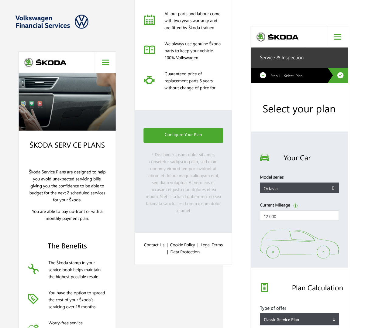
- 02A "one markup" approach was introduced, meaning the same HTML structure would be used across all brands. Only CSS would change to reflect each brand's identity.
My role.
I joined a team of five designers supporting multiple development teams. Each team was responsible for building one product and releasing it across various countries.
My primary responsibility was to shape the information architecture and design web and mobile interfaces based on user-centric UI/UX principles. But that was just the tip of the iceberg.
A multilayered design process.
Understanding & negotiating requirements
The design process began long before any interface was sketched. I worked closely with business analysts and clients, actively participating in workshops to define and clarify requirements. My goal was always to propose solutions that balanced user needs with marketing and business goals.
Technical awareness & developer collaboration
To be effective, I had to understand the entire development process. A critical part of this was working within a shared component library and being comfortable with CSS, HTML, frameworks, and grid systems. This technical grounding helped me design with feasibility in mind, and to optimize developers' work by minimizing complexity and avoiding unnecessary custom solutions.
Brand consistency across multiple guidelines
Another key part of my work was analyzing the style guides for each car brand — Volkswagen, Audi, SEAT, and Škoda — usually delivered in atomic design systems by external agencies. My role was to ensure a consistent and coherent user experience across all digital touchpoints, despite the visual differences between brands.
Iteration & implementation
After delivering initial designs, I integrated feedback from stakeholders, iterated on the concepts, and then collaborated closely with developers to ensure accurate implementation. This final stage was crucial in bridging the gap between design and development and maintaining high-quality outcomes.
My challenges — examples.
1
Designing with constraints.
The one-markup strategy and component library greatly accelerated development — but also imposed significant limitations. With so many products, brands, and countries involved, compromises were inevitable. My role was to ensure the best possible UX and clean UI within those boundaries. Often, business needs prioritized speed over pixel-perfection. It wasn't always possible to request new components or modify existing ones. I had to stay creative, think modularly, and adapt my design vision to fit within the available tools — while still delivering a usable and aesthetically consistent interface.
2
Limited access to users.
Due to project scale and confidentiality, direct access to end users was restricted. I relied heavily on my own expertise, desk research, and informal feedback from colleagues. While I always aimed to validate assumptions, the lack of formal user testing made it harder to prove design decisions with data. This occasionally made it challenging to convince stakeholders — even when I was confident in the UX reasoning behind a proposal.
3
Adapting to local needs.
Every country involved brought its own requirements, conventions, and user expectations. From form field formats (e.g., ZIP codes, national ID numbers) to local best practices for user verification, I had to carefully research and tailor design elements to meet regional standards while maintaining cohesion.
4
Navigating brand inconsistencies.
Staying consistent with brand style guides was essential — but not always straightforward. In theory, I knew the brand guidelines inside out. In practice, things were more complicated. For example, country-specific brand websites — often developed by external agencies — sometimes deviated from the official guidelines.
“Let's say the style guide defines a specific color palette for alert boxes. But when I checked Audi Spain and Audi France's websites, both used entirely different colors — neither aligned with the guide, and worse, neither passed WCAG contrast standards. So, what do you do? You weigh visual consistency, accessibility compliance, and user trust. A customer moving from Audi Spain's homepage to our insurance tool shouldn't feel like they've landed on a phishing site. Balancing all these aspects — and sometimes negotiating a middle ground — became part of my daily work.”
Lessons learned.
Wise compromise and clear communication were my personal keywords throughout this project. While user needs remained at the centre of every decision, I had to weigh them against other important factors — business objectives, development limitations, and timelines.
The system itself was complex. The CSS component library and one markup approach made the entire process manageable and helped us meet tight deadlines. But they also introduced new constraints for design. That's where the real challenge began.
At times, these limitations meant that the final UI looked slightly less refined than the visual tone of the brand homepages. As someone who values well-crafted interfaces, this was a bit disappointing. However, UX best practices were always in place, and that was what mattered most. From a marketing perspective, once the user is in the purchasing flow, clarity, ease, and speed outweigh purely aesthetic concerns.
Products available online — examples
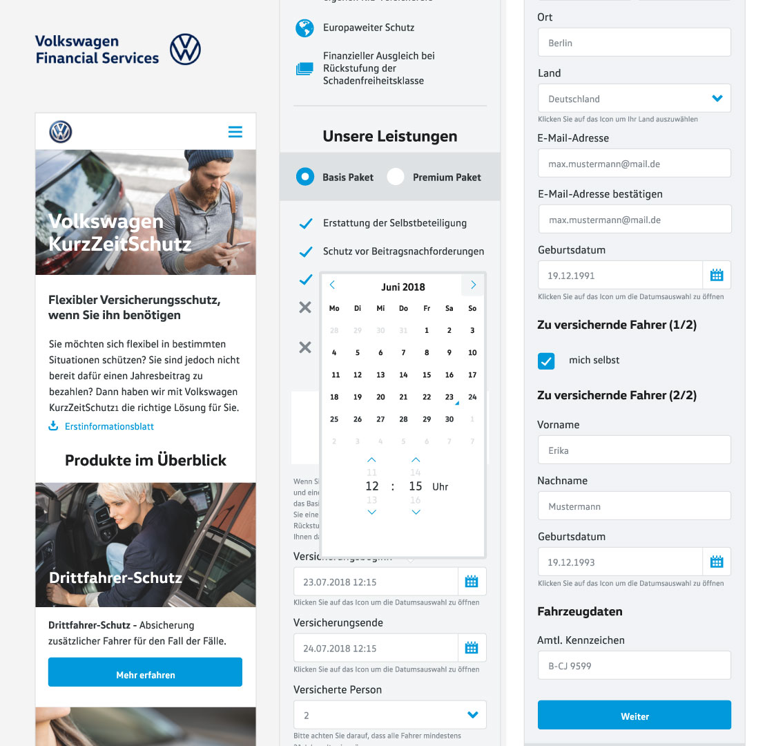
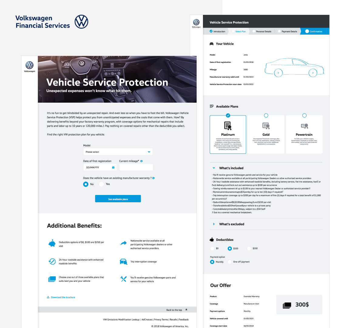
www.die-wartung.de · wartung-inspektion.de · skoda.wartung-inspektion.de · seat.wartung-inspektion.de · www.kurzzeitschutz.de
Summary.
I'm genuinely grateful for the opportunity to contribute to such a well-known brand and help shape the look and feel of products used by real customers. Of course, as part of a larger team, I was responsible for just a portion of the product — but even those fragments were complex and rewarding to tackle.
This project allowed me to participate in the full design lifecycle: from requirements gathering, through design and testing, to development collaboration. I'm proud to have contributed not just to the visual layer, but also to strategic decisions — helping evaluate what was worth investing time and resources in, and what wasn't.
Learning how to balance business goals, technical feasibility, and user expectations has been one of the most valuable takeaways from this experience.
Next case study
Quotebeam