Kingfisher
Autosuggest Search.
Designing a new search component through business discovery, benchmarking and iterative UX.
- Client
- DIY & home improvement e-commerce
- Role
- Product Designer
- Year
- 2022
- Scope
- Component design · Benchmarking
About the project.
A solid search feature is one of the key elements in driving conversions for any online business. Displaying smart search suggestions not only streamlines the process of finding the right product but also significantly boosts customer satisfaction.
I was tasked with designing a new autosuggest search component for a DIY and home improvement e-commerce platform. At the time, the existing search bar offered no suggestions. Users could type in any phrase, hit "search," and get redirected to a results page — often filled with random or loosely related products. This created a high risk of user frustration and drop-off, especially when results didn't align with their intent.
The goal of this project was to design a feature that would provide real-time search suggestions, helping users quickly narrow down their queries and increasing the likelihood of finding relevant results — ultimately improving the overall customer experience.
Challenge and problem definition.
According to the initial business requirements, the new search component needed to divide suggestions into two blocks: suggested phrases and suggested products. Beyond that, I had full ownership of the user experience and expected to make many additional design decisions along the way.
Early on, I planned to explore the idea of showing suggestions grouped by category, since all products on the site were already categorized. I also considered setting a maximum number of suggestions to avoid overwhelming the user. Additionally, I wanted to investigate other potential behaviors for the component — such as displaying previously searched terms — to further enhance usability.
Process.
- 01Discovery and benchmarking.
- 02Initial design proposal.
- 03Discussion with the stakeholders.
- 04Second iteration of the design.
1
Discovery and benchmarking.
As a frequent online shopper myself, I already had plenty of ideas about how the search component should behave, so I was eager to jump into early draft designs. Still, I wanted to approach the topic thoroughly, so I began with a benchmarking exercise. I looked at several e-commerce leaders, including Amazon and John Lewis, along with DIY and home decor stores like Ikea and Leroy Merlin. I also reviewed popular marketplace platforms like Allegro — and, of course, the gold standard in search: Google.
For the benchmarking phase, I focused on the following aspects of the autosuggest search experience:
- ·A. Behavior on focus — What happens when the user clicks into the search field?
- ·B. Minimum input — How many characters must be typed before suggestions appear?
- ·C. Result grouping — How are suggestions divided (e.g. by products, popular searches, recent searches, etc.)?
- ·D. Max suggestion count — What's the maximum number of items shown in the dropdown?
- ·E. Product categorization — Are suggestions grouped or labeled by category?
- ·F. Visual & data cues — Are there additional elements like product images, prices, or icons?
- ·G. Backdrop — Does the UI introduce a background layer to draw focus to the search?
- ·H. Keyboard behavior — How does the component support users navigating with the keyboard?
At the same time, I dove deeper into UX best practices — relying heavily on research and guidelines from the Baymard Institute. Since we didn't have the budget for pre-launch user testing (with A/B testing being a possible option after release), I knew I had to base my design decisions on both my own experience and well-established findings from industry research.
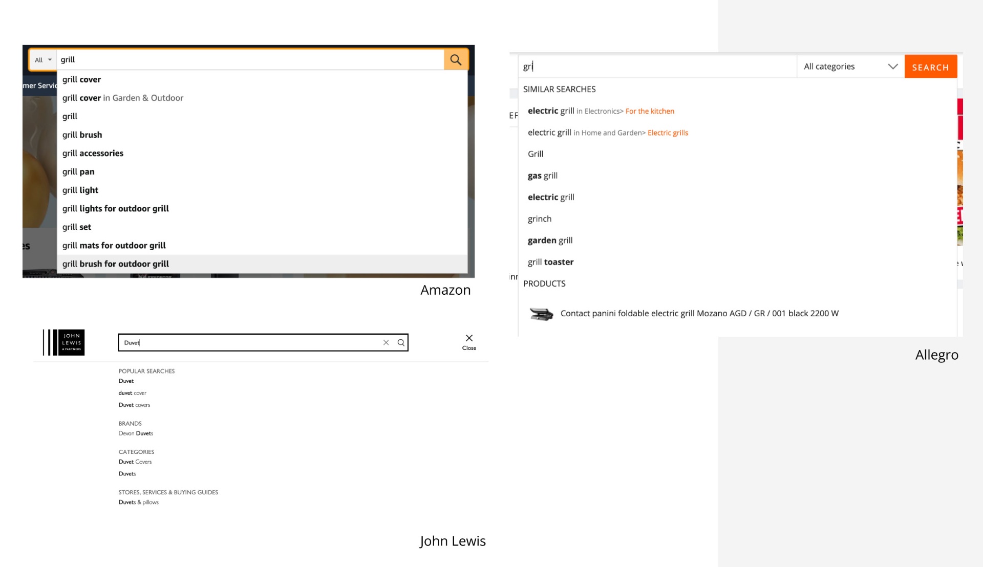
Baymard Institute guidelines — my key takeaways for designing autosuggest.
- ·Stick to convention — Avoid reinventing how autosuggest works. Unconventional solutions may confuse or mislead users rather than help them.
- ·Limit suggestions — Display no more than 10 suggestions on desktop and 4–8 on mobile to prevent overwhelming the user. A long list can lead to decision fatigue or cause users to ignore the suggestions entirely.
- ·Use styling to improve scannability — Thoughtful use of font weight, colors, spacing, and dividers helps users quickly scan and digest the suggestions.
- ·Differentiate input from suggestion — Make sure there's a clear visual distinction between the user's query and the predictive suggestion. Highlighting the suggestion (e.g., bolding) is preferred over highlighting the user input.
- ·Avoid scrollbars — Scrollbars inside autosuggest widgets are discouraged as they can interfere with usability and clarity.
- ·Reduce visual noise — Use shadows, backdrops, or borders to bring the autosuggest container to the foreground. Keep the content inside the widget clean — avoid large product images or anything that visually competes with the suggestions.
- ·Label suggestion blocks — If your suggestions can be grouped (e.g., products, categories, previous searches), label them clearly to support better navigation.
Mobile-specific tips
- ·Remove distractions — Ensure that elements like chat widgets don't cover or compete with the autosuggest area.
- ·Optimize for touch — Use proper font sizes and spacing to make each suggestion easily tappable.
- ·Hint at scrollability — If suggestions extend beyond the visible area, provide a visual clue that the list can be scrolled.
- ·Make cancelling easy — Ensure users can quickly clear or cancel their search with a clear action.
2
Initial design proposal.
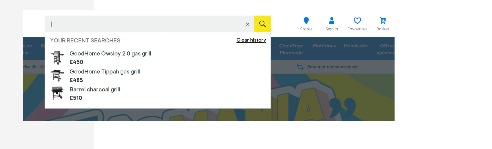
My initial design proposal addressed two core elements: the behavior on focus and the actual display of suggestions. Benchmarking revealed that many autosuggest widgets — like those used by Google, Ikea, or John Lewis — present the user's browsing history as soon as the search field is focused. Some, like Allegro, go a step further and display popular searches.
At first, I was hesitant about this approach. Displaying suggestions before the user begins typing might feel confusing or intrusive. Still, I decided to propose this solution to the business team, recognizing its potential marketing benefits: by surfacing the browsing history early, we could encourage users to revisit or reconsider previously viewed items. For cases where no history is available, I recommended that the field remain empty to avoid unnecessary distraction.
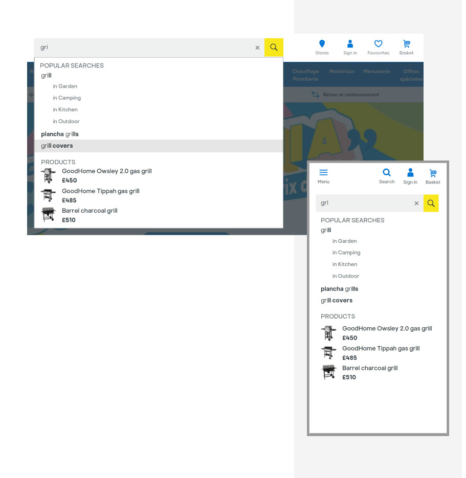
Once the user starts typing a query, suggestions appear. One of the first decisions I had to make was how many characters should trigger this behavior. Based on benchmarking insights — and considering that the dropdown would already be expanded due to the browsing history shown on focus — I proposed triggering suggestions after the first character. This approach is used by platforms like Amazon, Google, and Ikea. Still, I briefly considered waiting until the third character to help narrow down the results.
Following Baymard Institute's recommendations, which I found very intuitive, I displayed the user's query in a regular font while highlighting the suggested portion in bold. This helps improve scannability and comprehension.
In line with the business requirements, I divided the suggestions into two labeled blocks: popular searches and products. For the product suggestions, I included thumbnails and prices to make them more informative and engaging.
To improve clarity and relevance, I also categorized the first suggested term whenever possible — for example, "grill" could appear under Garden and Outdoor. Using categories makes the suggestions more precise and is also supported by Baymard's best practices. One question I had to address was whether to show just one category (like Amazon does) or several (as seen on other platforms). I leaned toward showing multiple categories if the term belonged to more than one — for instance, a "grill" could be found under Garden and Outdoor, Kitchen, and Camping.
To make the autosuggest experience visually prominent, I added a backdrop that dims the rest of the screen while the search widget is active. This helps reduce distractions and keeps the user focused.
Although I considered adding more content blocks (e.g., Brands, as used by John Lewis), I ultimately opted for simplicity to maintain a clean and focused experience.
In addition to the visual designs for web and mobile, I also prepared implementation guidelines. I recommended limiting the number of suggestions to 10 on desktop and 8 on mobile (including both search terms and product suggestions). For accessibility, I documented keyboard navigation behaviors similar to those used by Google:
- ·Tab to move focus to the suggestions
- ·Arrow keys to cycle through options
- ·Enter to select a suggestion
- ·Any other key to return focus to the input field
3 / 4
Discussion with the stakeholders and second iteration.
I presented the designs to the business team, along with a detailed explanation of my design rationale. The proposal was very well received, but after further discussions around technical feasibility, we agreed to implement a few minor adjustments to the initial concept.
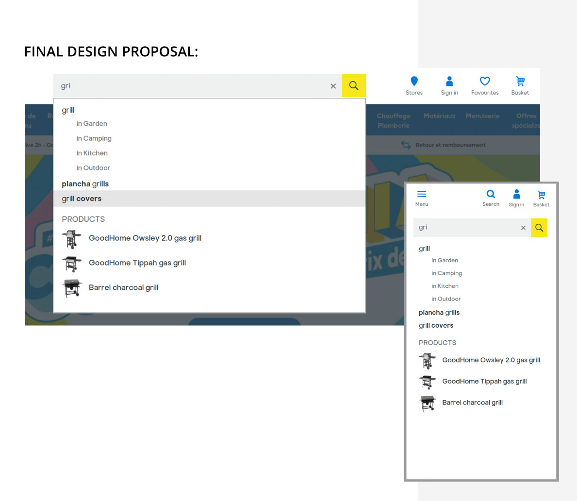
Due to technical constraints, the business decided not to display the browsing history. As a result, we adjusted the logic to trigger suggestions only after the user types the third character — helping to ensure that the results would be more relevant from the start.
We also decided to remove the "Popular Searches" label. In retrospect, I believe this was a great simplification. Since the autosuggest widget only contained two types of results (popular searches and product suggestions), omitting the label for the first section shouldn't cause any confusion for users.
Additionally, business stakeholders requested that we remove product prices from the widget. This change helped streamline the component visually and reduce cognitive load for the user.
Conclusions
Conclusions and key takeaways.
I really enjoyed working on this component. Unlike many other tasks I typically handle as a Product Designer, designing the autosuggest feature felt like building a distinct, standalone element — of course, still aligned with the overall page design — but with fewer dependencies than I usually encounter.
It was refreshing to run the process from start to finish and propose a solution that considered multiple layers — from UX best practices and UI details, to keyboard behavior and even potential marketing impact.
Naturally, I didn't describe every small or self-evident decision in this case study (like fine-tuning vertical padding between suggestions on mobile to ensure they're easily tappable), but I truly enjoyed paying attention to every detail of the experience.
One part of the process I found especially rewarding was benchmarking. Initially, I expected that autosuggest features across major sites would be fairly uniform. To my surprise, I discovered many subtle — yet meaningful — differences, which provided a strong foundation for questioning assumptions and shaping my own design decisions.
Next case study
Pharmaceutical (NDA)