Kingfisher
Local Pricing.
Introducing complex pricing functionality into an existing enterprise e-commerce ecosystem.
- Client
- DIY & home improvement retailer
- Role
- Product Designer
- Year
- 2022
- Scope
- Discovery · UX research · Enterprise UX
Client.
A DIY and home improvement retail company with both physical stores and an online shop.
About.
The concept of local pricing — adjusting prices based on the store's location — is a well-established practice in multi-store retail. Prices may vary due to regional factors, such as higher operating costs in large cities or the need to stay competitive in specific areas.
While this approach makes perfect sense in physical stores, applying it to e-commerce can be more challenging. Customers generally perceive online shops as independent entities and expect pricing to be consistent, regardless of which physical store might fulfill their order — even when they choose in-store pickup.
However, in the business model adopted by my client, local pricing applies across both physical and online sales. Even when a customer buys online, the purchase is processed by a specific store, and the transaction is tied to that location. This means that product prices in the online store may change depending on which store the user selects (if any).
This pricing model introduces several UX challenges. It requires thoughtful design to clearly communicate price changes and avoid confusing or frustrating users with unexpected differences in price at any stage of the shopping journey.
My role and the team.
As a Product Designer, I was tasked with implementing the local pricing functionality on the existing e-commerce site, tailored specifically to the French market. My role was to translate business requirements into the current user flows and interface, identifying what needed to change to support local pricing while ensuring a seamless, customer-centric experience that could also drive higher revenue.
I worked in close collaboration with a Business Analyst, who supported the process of gathering and interpreting the business needs. I also partnered with a UX Researcher, whose insights helped guide key design decisions and ensure that the proposed solutions aligned with real user expectations and behavior.
Process.
- 01Understanding business goals and technical limitations
- 02Defining key areas of interest and drafting initial flows
- 03Benchmarking
- 04Formulating initial hypothesis and research questions for competitor analysis
- 05Interpreting research results, creating flows and preliminary designs
- 06Validating designs with the business
- 07Creating prototypes for user research
- 08Incorporating research insights and agreeing on final designs with the business; handover to development team
What helped me on the way
Tools: Mural, Sketch, Marvel.
Methods: Benchmarking, UX research.
Insights: Baymard Institute guidelines.
1
Understanding business goals and technical limitations.
The main business objective was to significantly increase revenue by enabling price adjustments for a selected range of products. This flexibility allowed store managers to, for example, raise the price of a product that was unavailable at nearby competitors, or lower the price of another to ensure it was the most attractive offer in the local market.
2
Defining key areas of interest and drafting initial flows.
To tackle this complex task, I began by identifying the flows, pages, and functionalities that could be impacted by local pricing. It was similar to mapping out customer journey touchpoints, but with a focus strictly on the website and native apps. My goal was to understand which specific elements might need to change when implementing local pricing, and how those changes could influence customer behavior. Through this approach, I identified four key parts of the journey:
- ·Store selection process
- ·Product lister page
- ·Product detail page
- ·Basket page
The store selection flow quickly emerged as a critical part of the local pricing concept. Having a store selected simplifies the experience, allowing for local prices to be shown right away. However, even in this case, there were important questions to answer — what happens if a user decides to switch to a different store mid-journey?
Things became even more complex in the scenario where no store had been selected. Should we display "national" prices that might change after store selection, or avoid showing any prices at all until a store is chosen? Should we nudge the user to select a store, and if so — how prominently? Would a subtle prompt suffice, or should we consider a more assertive message? We also explored the idea of using geolocation to suggest the nearest store, or preselecting a default location, such as the flagship store in the capital.
Product Listing and Product Detail Page — this stage of the journey was all about messaging. The key question was: how transparent should we be with the user regarding potential price changes? Should we proactively inform users that prices may vary depending on the selected store? Or should we only alert them once the price actually changes? Another option was to avoid drawing attention to it altogether, and simply update the prices in the background. Each approach had its pros and cons in terms of transparency, trust, and user experience — and choosing the right one was crucial to avoid confusion or frustration.
The basket page posed a very similar challenge, as messaging around local pricing needed to remain consistent wherever prices were displayed. However, there were additional factors to consider. Should users be allowed to add items to the basket without selecting a store first? Should we require store selection at this stage? And how should we communicate changes in the total amount payable if the prices adjust based on store selection?
Defining these key areas helped me sketch out some initial user flows. It also made me aware of other important factors that could influence the experience — such as whether the user is browsing as a guest or logged in, or whether the selected store actually has the product in stock. I organized my questions and assumptions, and from there, I was ready to move forward.
3
Benchmarking.
Work on this task progressed in parallel with the previous one.
I went through an extensive benchmarking process to understand how other companies approach the challenge of local pricing. Surprisingly, there was no clear or dominant pattern. I looked into both direct competitors in the DIY and home improvement space, as well as other retail players — focusing mainly on French and Polish e-commerce sites, as the feature was planned for these two markets.
I paid particular attention to the following aspects:
Use of geolocation
Geolocation enabled without user consent — e.g. leroymerlin.fr. Browser prompt asking to enable geolocation — homedepot.com. No geolocation used — bricodepot.fr.
Store preselection
A store is automatically preselected for every user, regardless of location — e.g. bricoman.pl. No store preselected in most other cases.
Messaging around local pricing
No messaging at all, even after the price changes — bricoman.pl. Subtle messaging shown after a price change — carrefour.fr. Proactive messaging with suggested pricing info — castorama.pl. Strong, attention-grabbing prompts encouraging users to select a store — bricodepot.fr.
Apart from the high-level comparison, I also took a deep dive into the UI components used to communicate local pricing. I examined how competitor sites present the messaging — do they use modals, inline text, disappearing notifications, or something else? I paid special attention to how prominent these elements were and how likely users were to actually notice them. I also compared desktop and mobile views, and when possible, reviewed native app implementations as well.
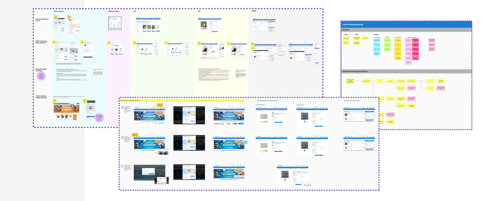
To support discussion and collaboration, I documented the key findings and open questions in Mural. This turned out to be a very useful tool during presentations and micro-workshops, where I invited participants to brainstorm, leave comments, and vote on preferred solutions — taking into account technical feasibility, business goals, and legal requirements.
This approach was especially important to me. While it could be argued that involving so many perspectives early on might limit design creativity, I believe it actually saved time and resources. Being aware of constraints early in the process meant avoiding the risk of exploring or testing ideas that were ultimately unfeasible or unacceptable from a business standpoint.
4
Formulating initial hypothesis and research questions for competitor analysis.
The knowledge I had gathered so far allowed me to draw some initial conclusions — but more importantly, it helped me define the key questions that needed to be answered in order to create a well-thought-out, user-centered design.
I decided to focus on two main areas that I wanted to explore further through UX research. For each area, I formulated a set of key questions and shared them with our UX researcher to guide the next steps.
Store selection
What's the best strategy for store selection when the user is browsing as a guest? Should we use geolocation to automatically select a store? If so, should we inform the user that a store has been preselected for them?
Price change communication
How do users interpret the term "suggested price" when they see it on the product detail page? Do customers notice when the price changes? And if so, how do they react? Does mentioning that the price may change influence user behavior in any noticeable way? What's the most effective way to communicate that a price has changed — visually and contextually? Should we inform users before or after the price change happens?
We had a thorough discussion with our UX researcher about the best approach to move forward with the study. While testing our own mockups was one of the options on the table, we ultimately decided that evaluating existing competitor sites would give us a stronger, more grounded set of insights.
5
Interpreting research results, creating flows and preliminary designs.
The research was conducted with a group of eight participants, all native French speakers living in France. As per the business decision, we focused on the French market first. Participants tested both desktop and mobile versions of leroymerlin.fr and bricodepot.fr, as these two e-commerce sites reflect different strategies in store selection and customer communication.
Communication — key insights
Users do not understand why the price has changed if there is no message indicating that or… they haven't read it. They are very surprised and suspicious when the price changes (some of them do not want to continue shopping). "Honesty" of the retailer is crucial to them and the price change is perceived as a dishonest practice.
Pop-ups that are too aggressive and appear at every step of the journey are very annoying to the users.
Users that understand the concept of local pricing would like to see both national and the local price for the selected store on PDP page.
Having these insights at my disposal, I was ready to create initial design proposal along with the diagrams and flows, to facilitate further discussions with the business.
6
Validating designs with the business.
I presented my designs along with the design rationale to the business. Based on the research insights, but also on the best UX practices and Baymard Institute guidelines (some of these listed below), I decided to take the following approach:
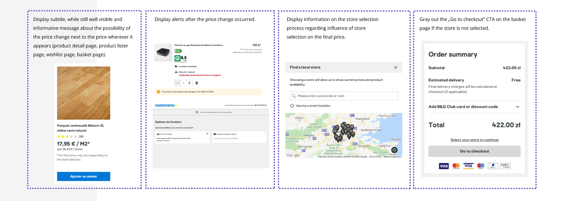
- ·Display subtle, while still well visible and informative message about the possibility of the price change next to the price wherever it appears (product detail page, product lister page, wishlist page, basket page).
- ·Display alerts after the price change occurred.
- ·Display information on the store selection process regarding influence of store selection on the final price.
- ·Gray out the "Go to checkout" CTA on the basket page if the store is not selected.
I was willing to propose some broader changes like splash page for store selection, but I was well aware of the limitations of scope for the local pricing functionality, at least for the initial release.
Baymard doesn't offer specific recommendations for local pricing as a standalone functionality, but we can draw valuable insights from their broader guidelines around related topics. One of their key suggestions is to consider IP geotargeting, and if there's a need for country, language, or store selection — this should ideally be handled through a splash page. They strongly advise against using modals or overlay dialogs for such purposes, as these are often perceived as ads and are quickly dismissed by users.
7
Creating prototypes for user research.
Our UX researcher conducted a similar round of interviews with 8 participants from France, this time testing the prototype.
The research results didn't highlight any issues with the overall flows or UX patterns, which was a great confirmation of the direction we were taking. However, a few areas in the UI stood out as needing more attention. One key insight was that the information about price changes could be made more prominent — this would help ensure users notice and understand it clearly.
Another point of improvement was the mobile experience, especially around the store selection screen. Due to limited screen space and occasional header changes (often caused by additional marketing messages), the interface became cluttered and hard to navigate. I decided to revisit this screen and rework it into a much simpler, more focused version to enhance clarity and usability.
8
Incorporating research insights and agreeing on final designs with the business. Handover to development team.
The design changes were incorporated, approved by the business, and handed over to the development team.
While that sentence might sound like a simple, straightforward step in the process, anyone who's worked as a UX/Product Designer in a larger organization knows that getting there is rarely quick or easy. Aligning multiple stakeholders, evaluating technical feasibility, estimating effort, and navigating cross-team dependencies takes time — and a good dose of patience. It also requires the ability to stand behind your decisions while staying open to feedback and compromise.
Next case study
Kingfisher