Quotebeam
Startup Rebranding.
Creating a complete brand identity, marketing assets and a scalable design system.
- Client
- Quotebeam
- Role
- Product Designer & Brand Lead
- Year
- 2022 — 2023
- Scope
- Brand identity · Design system · Marketing
Context.
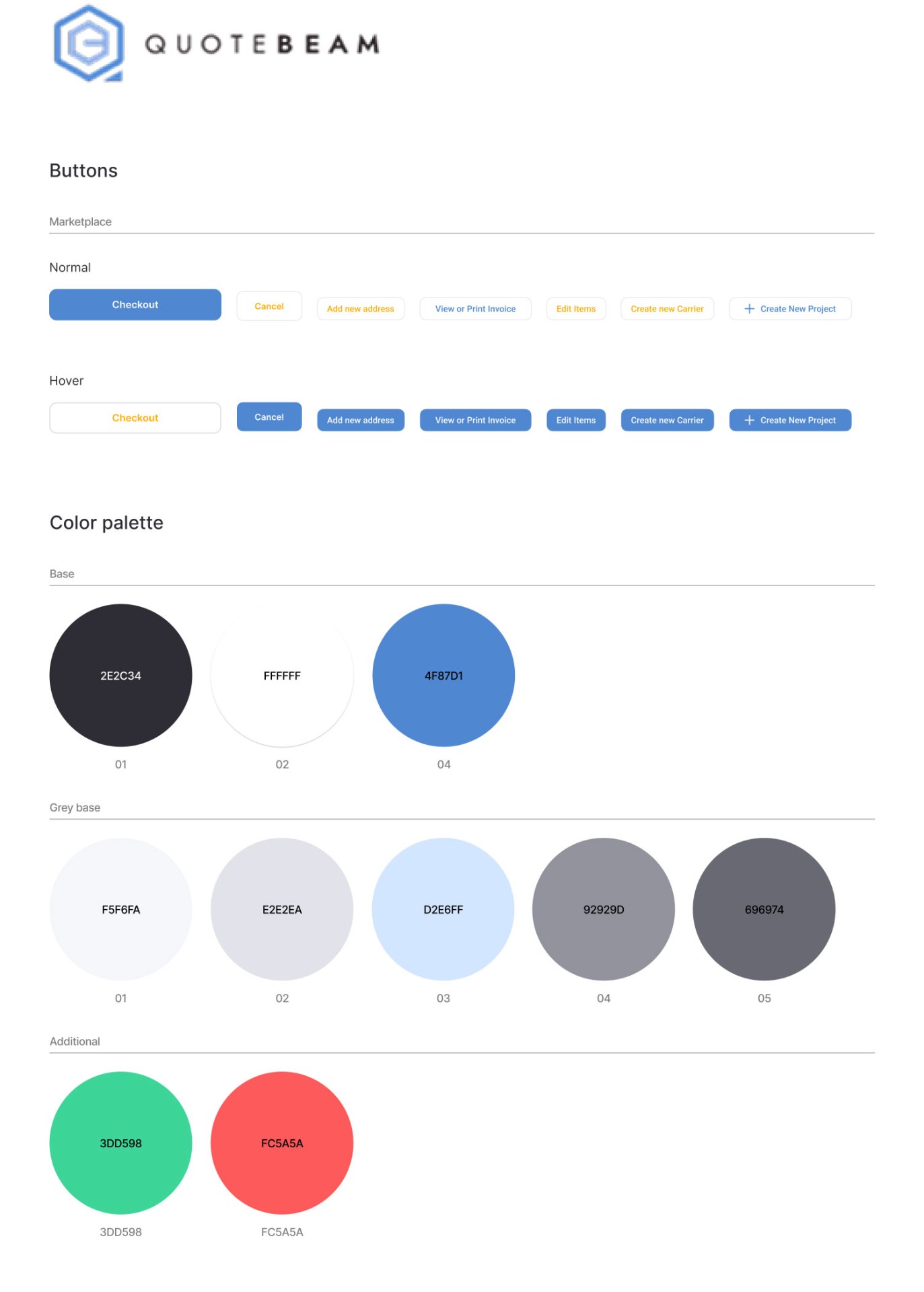
When I joined Quotebeam as the first in-house designer, I was introduced to the MVP of the product — a basic marketplace with essential selling functionalities and a company landing page. The app had been built using designs provided by an external agency, whose services the founder decided to discontinue upon bringing me on board.
A quick audit of the existing features and visual assets sparked several ideas for how we could improve both the company's branding and the UI/UX patterns. At the same time, I didn't find any major usability issues or significant inconsistencies in the brand identity that would require immediate attention. As a result, together with the founders, we decided to continue working within the current brand and design system while leaving the door open for future updates.
Client.
Quotebeam is a startup I had the pleasure of working with as a product designer for 2.5 years. Initially, the company functioned as a marketplace for automation parts, allowing local distributors in the U.S. to list their products while buyers worldwide could purchase them or request a quote. Over time, the company expanded into offering a SaaS product — an e-commerce store and website solution tailored to U.S.-based automation parts distributors looking to complement their traditional sales models with an online presence. This digital product eventually became Quotebeam's core offering.
My role.
Working with Quotebeam provided me with a full startup experience, where I, as a product designer, had a significant influence on the development of our software. This was largely possible because the company, at that stage, had around ten employees, for whom I was either the sole designer or shared my duties with one other colleague. My responsibilities ranged from engaging in discussions about customer needs and planned functionalities to shaping them into process flows and designing individual screens.
My primary role was twofold: ensuring an excellent experience for the end customers visiting the online store and creating tools that empowered sales agents to drive more sales. Additionally, due to my background in graphic design, I was responsible for the company's branding and the creation of our design system.
Decision to initiate a rebrand.
That opportunity came about a year later. The company had started growing, adding new hires in both sales and marketing, along with a second product designer. We returned to the topic of brand identity, recognizing the significant role a well-crafted brand voice could play in shaping Quotebeam's sales proposition.
The key concerns we identified with the existing branding included:
- ·A lack of distinct personality and visual style
- ·A color palette that failed to stand out from competitors (most small industrial distributors relied on combinations of blue and gray, with occasional use of red — these two palettes had essentially become industry defaults)
- ·A logo that was unclear and difficult to interpret (a fusion of the letters "Q" and "B" that didn't communicate meaning effectively)
- ·The absence of a "mascot" or recognizable character to humanize the brand and support marketing efforts
To kick off the rebrand, we organized a two-day workshop to define a clear brand vision and align on how we wanted Quotebeam to be perceived by its users. This session laid the foundation for future design decisions. Among other exercises, we used brand archetypes to position Quotebeam as a blend of the Wizard and the Creator. We made a conscious decision to pursue boldness and modernity in our brand's look and feel while maintaining a tone of friendly guidance throughout the user experience.
Our team entrusted me with the full ownership of the rebranding process — both a sign of strong trust and a recognition of the visual work I had contributed so far. While branding is not typically part of a product designer's day-to-day responsibilities — and would often be outsourced or handled by a separate graphic design team — I chose to take on the challenge myself. This decision was shaped by my prior experience in visual design (art school background, years of work as a graphic designer), my deep understanding of our market, and the startup mindset of "all hands on deck." I have to say, this project brought me a great deal of creative satisfaction.
Below, I'll walk through select branding elements I created and the thinking behind them.
Logo.
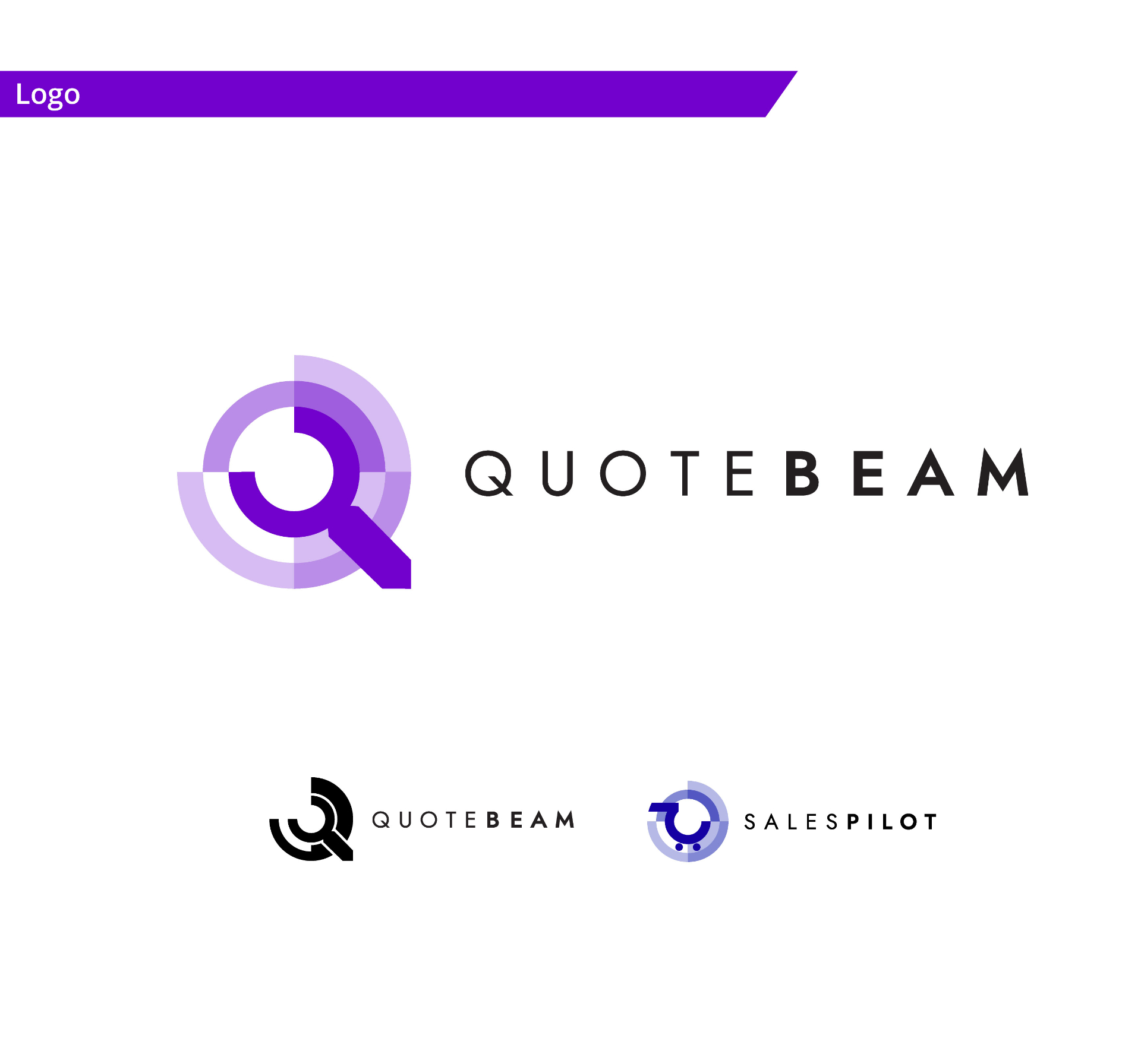
Redesigning the logo was one of my first major tasks. I wanted the symbol to communicate more than just the initials of the company name — it needed to carry meaning. At the same time, I aimed to retain some visual connection to the original mark, while also ensuring the new logo would be easily adaptable across various use cases, including favicons, app icons, and print materials.
After several iterations and close collaboration with the team, we landed on the version shown on the left. The most immediate interpretation of the logo is that of a magnifying glass — representing the core action users take when interacting with our platform: searching for parts.
But the symbol also contains additional layers of meaning:
- ·The primary shape can also be seen as a wrench, subtly referencing the automation parts industry.
- ·The segmented areas around the main form create a visual resembling a target or bullseye, symbolizing precision and successfully reaching one's goal.
- ·The outer contour of the logo echoes the letter "Q", tying the mark back to the company name.
We decided to keep the original typography to maintain a sense of continuity and not fully break from the previous identity.
The two examples below illustrate a simplified black-and-white version of the logo, designed for specific contexts where a minimal, high-contrast variant is needed; and a conceptual extension of the logo system, showing how the core identity could be adapted to support future sub-brands or products under the Quotebeam umbrella. These variants preserve a strong link to the main brand while allowing for clear product differentiation.
Brand colors and fonts.
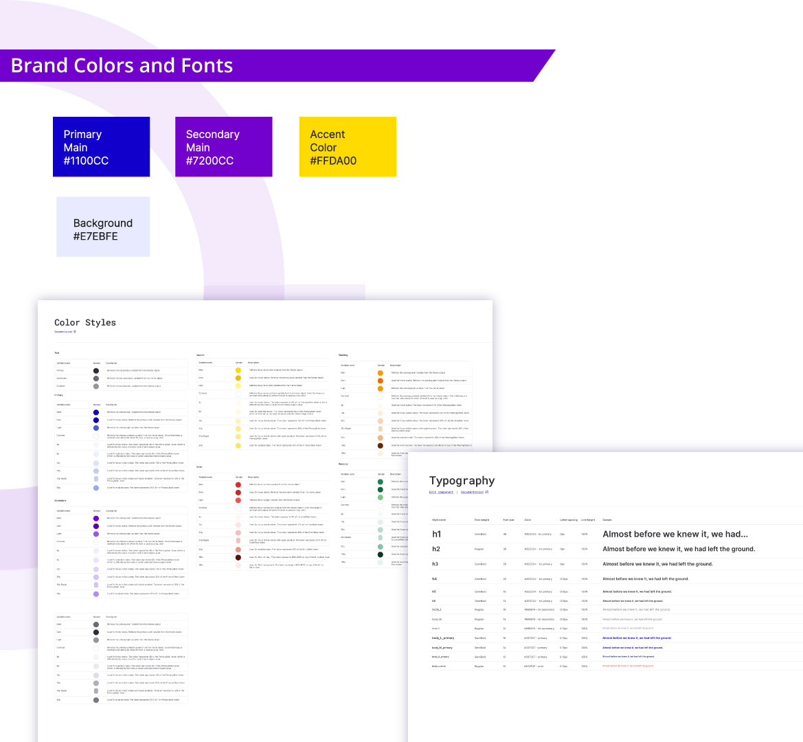
Alongside the new logo, we introduced a refreshed brand color palette. I selected bold, saturated tones that conveyed a sense of courage and an unapologetic approach to innovation. At the same time, our primary and secondary colors: navy and violet — while intense, still referenced the dominant hues commonly seen in the industry. We simply chose to push these familiar colors further, maximizing their visual impact and emotional resonance.
A vibrant yellow was introduced as an accent color, primarily used in branding materials to add energy and contrast. Meanwhile, navy and violet became the designated primary and secondary colors for the application's UI.
Establishing the color system went hand-in-hand with selecting typography for the brand. I created a full set of color shades and additional supportive hues needed for a complete UI — ensuring accessibility, visual hierarchy, and versatility.
This process also included defining standard typographic elements, such as heading levels and body text styles, which laid the foundation for our evolving design system — a key focus of the next stage in the branding and product design work.
Design system.
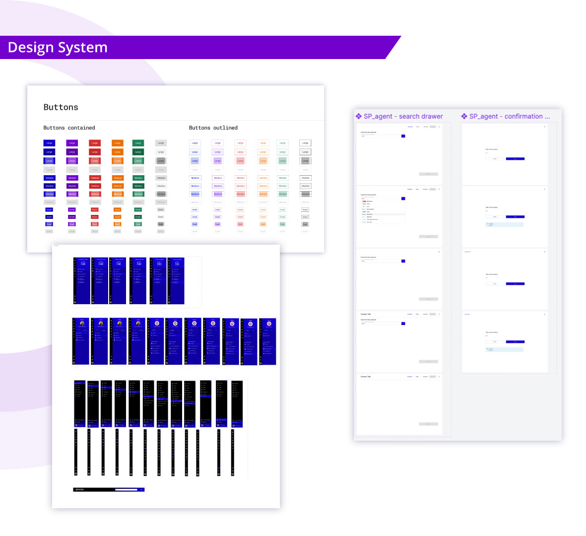
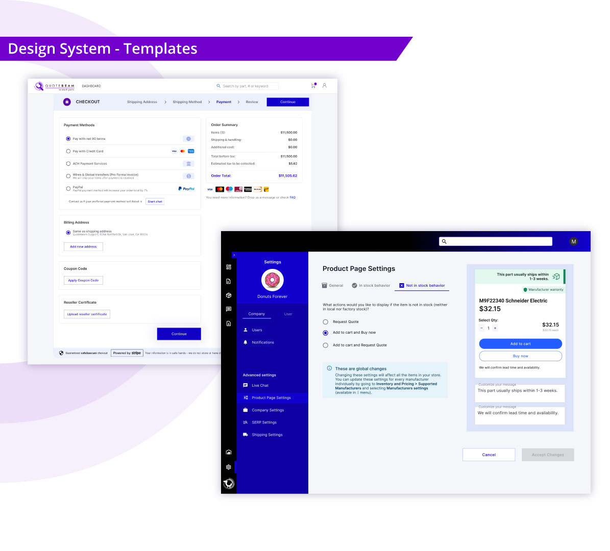
As mentioned earlier, the rebranding process also triggered a complete redefinition of our design system. Working closely with our front-end developers, we collectively decided to switch the front-end technology stack and adopt MUI — a React component library. MUI not only offered a comprehensive set of pre-built components, but also provided a Figma-compatible design kit, which allowed me to design directly using the same components developers would later implement.
Choosing a ready-to-use component library was crucial. We needed to scale our product quickly and manage time efficiently — both my own as a designer and that of the development team. At the same time, we invested considerable effort in customizing the MUI library to meet our specific product and branding requirements.
This process can be divided into two key stages:
1
Component customization.
We began by adjusting base UI elements such as buttons, input fields, and tables to reflect our new branding. This involved standardizing fundamental visual attributes — colors, corner radius, shadows — but also making more nuanced design decisions, like defining the sizing of input fields.
These choices had a significant impact on the overall look and feel of the product. Our goal was to strike a balance between two extremes: the highly polished, oversized UI components typically seen in B2C platforms, and the dense, Excel-like interfaces often preferred in B2B tools. The outcome was a pragmatic, scalable interface tailored to our users' needs and behaviors.
2
Building complex interface structures.
Beyond basic components, I was also responsible for creating more complex UI structures — what the atomic design methodology refers to as organisms and templates. These elements couldn't be lifted from a library; they needed to be designed from scratch.
This was an ongoing effort. For example, when designing a new drawer template, I focused on several key criteria:
- ·Clear, intuitive usability
- ·Reusability across multiple contexts within the app
- ·Long-term maintainability
- ·Strategic alignment with development time and business goals
Each structural element had to be justified — not just from a design perspective, but as a meaningful and efficient investment for the front-end team.
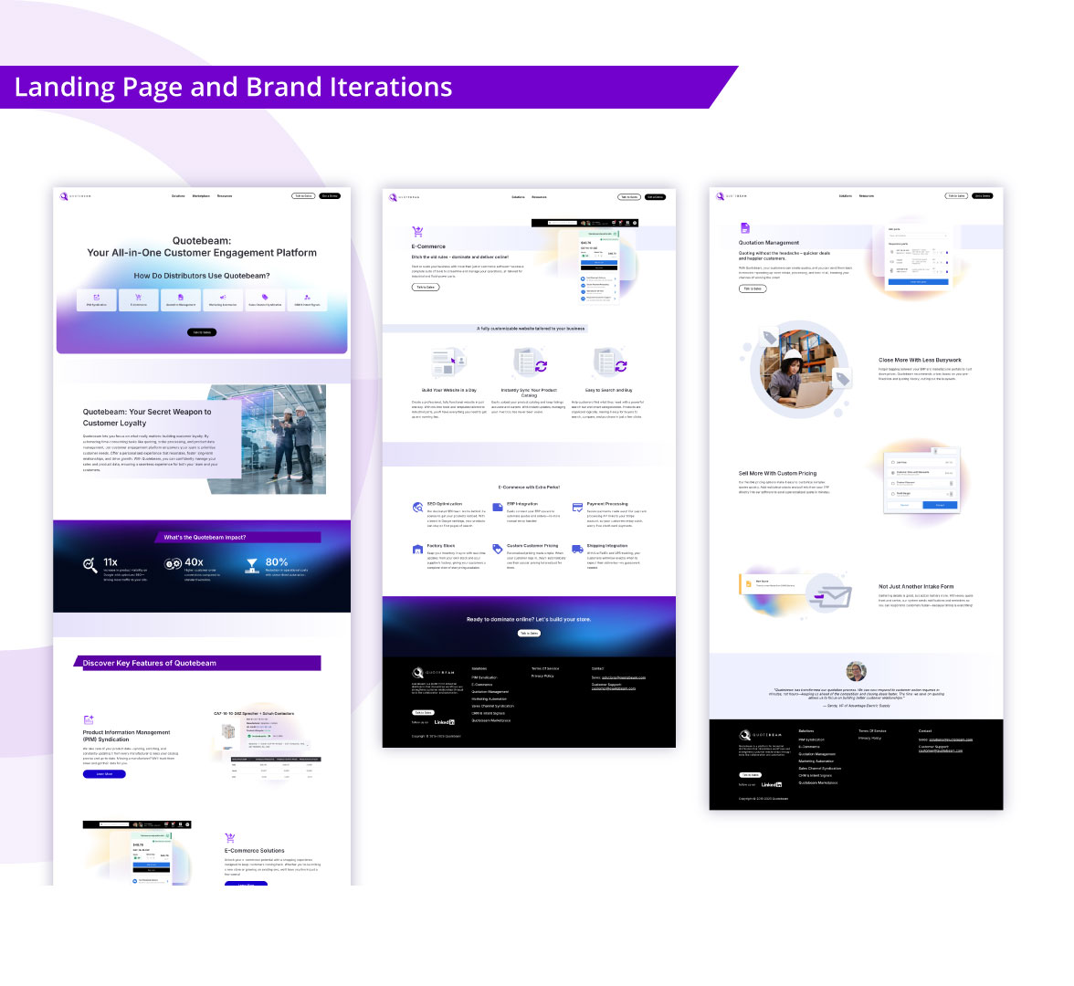
Landing page and brand iterations.
As part of the branding work, I also designed the company's landing page. This concept evolved significantly over time. The tone and style of the page became a visual extension of the messaging developed in collaboration with the marketing team, who continuously explored and tested different approaches to engaging potential customers.
We experimented with a wide range of narratives — from bold and slightly eccentric messaging to more conservative and professional tones. These iterations taught me patience and humility. I embraced each new version with an explorer's mindset, understanding that experimentation is fundamental in a startup environment. Each version was a response to real-time feedback and data, helping us refine both the communication style and visual direction.
In the following pages, I also showcase additional branding assets — for example, creatives designed for a LinkedIn ad campaign. You may notice visual inconsistencies between those materials and the current look of the landing page. This is a direct result of the iterative branding process we went through during my 2.5 years with Quotebeam. What may appear as inconsistency is actually a snapshot of a brand in motion — growing, adjusting, and aligning with both business insights and customer feedback.
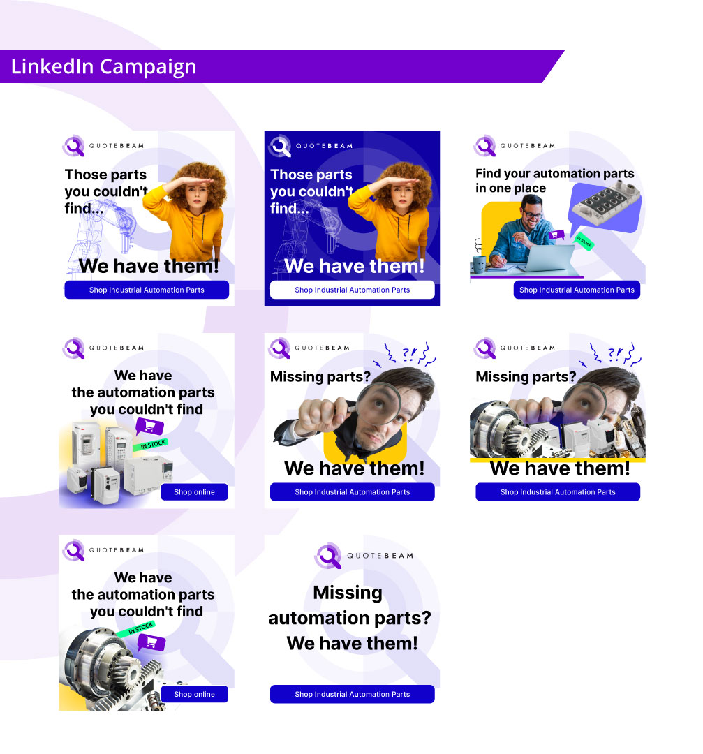
LinkedIn campaign.
The LinkedIn campaign shown here represents one of the bolder directions we explored in our communication style. While we consistently adhered to our chosen typography and color palette throughout the entire branding effort — and the logo was especially well received — our illustrative assets evolved more freely over time.
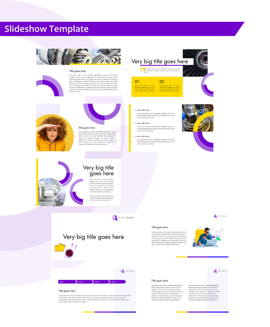
Slideshow template.
Continuing with examples of how our visual assets evolved over time, the slideshow templates shown on the left illustrate two distinct directions. The first five slides carry forward the bold visual language introduced in the LinkedIn campaign above — confident, expressive, and attention-grabbing.
The following four slides, on the other hand, represent a more subtle and content-focused approach. While still aligned with Quotebeam's brand identity, this version prioritizes clarity and ease of reading, allowing the presented information to take center stage over strong visual elements.
By designing multiple versions of our presentation templates, we empowered team members to choose the style that best matched both the content and the audience of their materials.
Brand mascot.
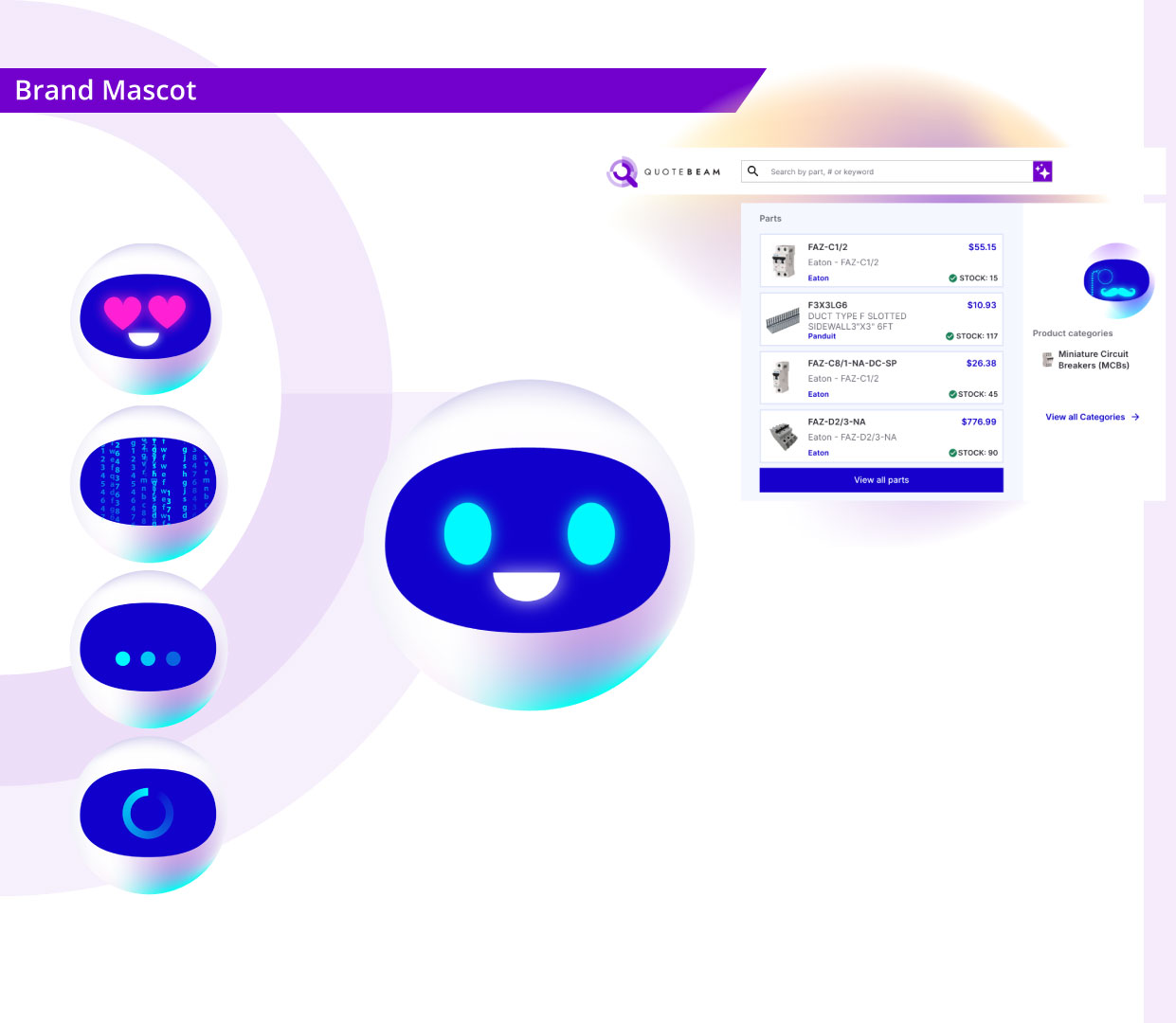
Designing the brand mascot was one of the most challenging creative tasks I faced. It was a key requirement from the marketing team, who envisioned it as a tool to humanize the brand and make it feel warmer and more approachable.
As I began the process, I focused on gathering the right requirements — both visual and practical. The mascot needed to be easily adaptable to various contexts, reusable across media, and simple enough to maintain and scale without external support.
We wanted the character to feel modern and reflective of technological innovation. This naturally led us toward a robot-inspired form. At the same time, it needed to express a wide range of emotions, statuses, and product states — so I decided to give it a screen-like face, capable of transforming easily through animated expressions.
Because we planned to animate the mascot directly within the interface, I kept the design minimal and modular. This approach allowed me to independently create lightweight animations within my own skillset and time constraints — no Pixar-level production needed.
Final thoughts.
Redefining Quotebeam's branding was a multifaceted journey that extended far beyond visual refresh — it was about shaping the personality of the company, aligning design with product vision, and building consistency across every user and brand touchpoint.
From the creation of a new logo and color system, through the development of a flexible design system, to the crafting of marketing assets and a brand mascot — each element was designed with intention, rooted in cross-functional collaboration, and shaped by real product and business needs.
What made this process truly rewarding was the trust placed in me by the team and the creative freedom I was given. While branding is not traditionally considered part of a product designer's core responsibilities, this experience showcased how versatile design roles can be in startup environments — and how impactful a unified design vision can be across product, marketing, and business.
This project taught me patience, adaptability, and the power of iteration. It reaffirmed my belief that a strong brand isn't just how something looks — but how it feels, behaves, and communicates with its audience.
Next case study
Kingfisher